While even quite ordinary photos can look good on today’s screens, choosing the right media can make a real difference it comes to printing your photos.
Most people view their photos and videos on handheld devices, or on computer monitors when files are uploaded. But that’s not the complete picture for photo enthusiasts, who take advantage of a wider range of output options.
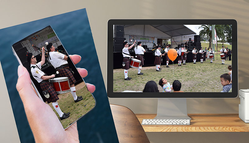
While most people view their photos on their phone screens or a computer monitor, as shown here, they may not appreciate the value of printing their best shots – or the wide differences between viewing images on screens and on paper as outlined below.
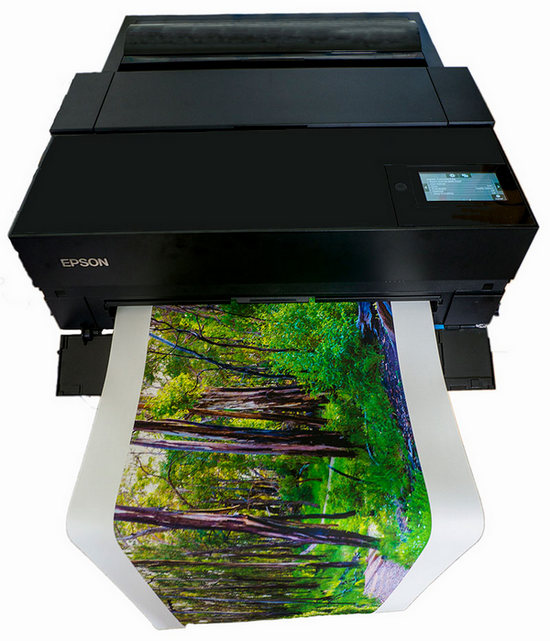
Our last reader survey revealed 85% of Photo Review readers print their own photos and 68% of them plan to make prints larger than 5 x 7-inch size this year. In response to these findings, we’ve prepared an overview of the output options currently available in Australia.
Screen vs paper
It’s important to understand how much the experience of viewing images on a screen differs from gazing at a printed picture. Because screens emit light, they’re able to display a wider and brighter range of colour tones than paper, which is viewed by reflected light. Many screens have contrast ratios greater than 1000:1, whereas the contrast ratios of glossy papers are about 200:1 and matte papers are around 100:1.
Fortunately, human eyes normally only process a dynamic ranger of up to eight stops, which is also the maximum dynamic range most inkjet papers can record (but probably less for some paper/ink combinations). Furthermore, you can’t compare images by looking at a printed image and an on-screen display under the same lighting conditions because the colours aren’t displayed the same way.
Both views can also be influenced by ambient lighting. Prints generally look best in bright lighting, whereas images are best viewed on screens when the ambient lighting is low and muted. (It’s best to make your editing decisions in a relatively dimly-lit room.)
The best approximation you can achieve of how your images will look when printed while you’re viewing them on your monitor screen is through soft proofing, where the monitor is adjusted to provide a simulation of how the image will look when printed on paper. You can read more about this process here.
Soft proofing provides a way to change the image displayed on your computer’s screen to simulate the way it will appear when it’s printed on paper.
Matching media to picture
Photographers today can choose from a huge range of output media that includes glossy, semi-gloss and matte papers, canvas and special fabric-based surfaces and ‘fine art’ papers of various thicknesses and textures. While most papers are made from wood pulp, which may be bleached or contain optical brighteners to make it appear white, other types of fibre are also used. These include Japanese ‘washi’ papers and papers containing hemp and bamboo fibres.
Papers made with cotton waste are usually seen to have the highest quality and offer the greatest durability. The percentage of cotton with respect to wood pulp can also determine the ‘archival’ quality of the paper. There are also ‘metallic’ papers with micro crystals in the coating that impart a shimmering metallic effect.
There is no right or wrong paper to use – it all comes down to personal preference. However, papers containing optical brighteners should be avoided if you want ‘archival’ prints because the effects of the brighteners decline over time, causing the base paper to become buff-coloured.
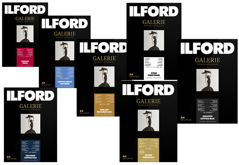
Ilford is one of the leading manufacturers of inkjet media with a wide variety of products in its portfolio, with a wide variety of products in its portfolio, some of which are shown here.
Papers can be fitted into different categories, according to their surface texture, composition, base tone, and thickness and they can be ‘archival’ quality or simply for everyday use. Here’s how to match papers with different image requirements.
1. Surface textures. Inkjet papers are grouped into four main classes by their surface textures: glossy, semi-gloss, matte and ‘fine art’.
High-gloss papers are the best choice for images you want to print with maximum sharpness and colour saturation. Because of their relatively high contrast ratios, they reflect the most detail and richest colours.
Unfortunately, they have a couple of downsides: the highly reflective surface of the paper can interfere with viewing quality and it’s prone to showing fingerprints. These papers require careful handling and are best displayed behind non-reflecting glass (which also slightly reduces their reflectivity).
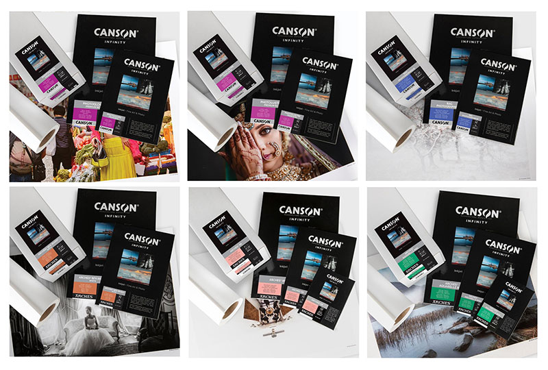
Specialist manufacturers market their papers as both rolls and sheets, with a wide choice of paper sizes, thicknesses and surface finishes. Some examples of the Canson range are shown here. These papers are available at specialist outlets that cater for professional photographers and serious enthusiasts.
Semi-gloss, satin and pearl finished papers are good choices for everyday printing as they combine good durability and colour reproduction. Because they’re much less reflective than glossy media, they don’t pick up fingerprints as easily and are seldom affected by specular reflections so they let viewers focus on the details in the image.
Baryta papers are a special category in this group because their surfaces have been created to replicate the smooth finish, rich tonality and low gloss of a traditional darkroom print. A good choice for fine art prints because of their longevity, they are particularly popular for printing black and white images. Use Baryta papers when you want to add a ‘quality’ impression and enhance the details and definition in your images.
Matte papers have completely non-reflective surfaces that tolerate handling. Thinner matte papers are often used for photo books, while thicker matte papers can fall into the ‘fine art’ category, which also includes papers with textured surfaces.
Canvas media have become quite popular in recent years and many desktop inkjet printers are able to print on them. While the texture of the canvas tends to smooth away finer details and mute colours in an image, the canvas ‘look and feel’ adds an air of ‘quality’ to the print.
Most A2 desktop printers can be used for printing on canvas and some, like the one shown above, can be fitted with roll paper holders to make it easy to produce panoramic prints.
Most printers that support canvas media also allow users to produce panoramic prints and this is an area where canvas media can excel. Unfortunately, large canvas prints can be prone to warping, so care must be taken when they are mounted. Finished prints should also be sprayed with lacquer to preserve their integrity.
Self-adhesive inkjet printable fabrics are relatively new media. They’re often used for exhibitions, marketing and advertising because they can be stuck directly onto walls and when removed, will leave no residue. They only come in rolls, generally 24-inches wide so they’re only available at commercial printing stores.
2. Tonality. Inkjet papers are classified as warm or cool tone, according to their base colour. Cool papers are brighter white, while warm paper displays the subtle natural tone of the fibre from which the paper was made. Warm papers are usually more durable.
Cool papers often contain optical brighteners, which are added to the coatings to make them look whiter – which they do by absorbing ultraviolet (UV) light and re-emitting it as visible blue light. This process degrades over time and papers that were initially bright white will eventually end up looking more buff-coloured.
The base tone of the paper you choose will affect the overall look of the printed image. Colours and contrast will be enhanced by printing the image on white paper, while portraits will generally look better on warm-toned papers which produce a more natural look for images with subtle tonality. Metallic papers go a step further than cool-toned papers and will amplify the vibrant hues and dynamic contrasts in the image, whatever its tonality.
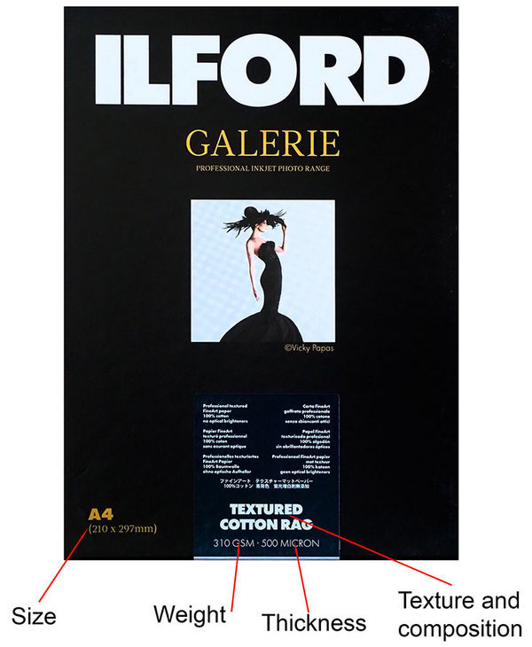
Where to find the critical information on a pack of paper.
3. Thickness. Inkjet papers are usually defined by their thickness, which is usually stated in GSM (grams per square metre). The following categories are commonly found:
Lightweight Paper (75-100 GSM) includes standard office paper and papers used for everyday stationery. They aren’t usually recommended for photo printing because of their comparatively flimsy feel. Nor should they be used for photo books because images can ‘show through’ from the back of a page.
Medium Weight Paper (120-250 GSM) is the most common weight for everyday photo printing papers.
For photo books, the best weights are between 170 and 200 GSM, while for prints larger than A4 size, 300 GSM should be the minimum weight.
Heavyweight papers include many textured ‘fine art’ media. They can lend a ‘prestige’ look and feel to printed images, although if the texture is very prominent it may hide fine details in images and interfere with the overall perception of the scene. These papers often require special printer settings.
When choosing papers, think about how your print will be used. Will it be subject to regular handling, like most snapshots are or will it be mounted and/or framed? If so, will it be behind glass or Perspex and what kind of lighting will be used in the display area?
Presentation
If you want to make the most of your photos, they deserve to be printed and displayed. But, how should you go about it?
Framing and lighting are complex topics but it’s worth noting that glass creates glare and bright reflections if the lighting is not correctly angled. This is true for all paper surfaces. Consider using a non-reflective covering – although understand that it may reduce the overall impact of the original photo.
Prints on matte media can look best when framed without glass because this allows viewers to enjoy the natural finish of the media. Consider omitting the covering and simply protecting the print with a varnish spray or using a deep box frame that positions the paper well back from the glass.
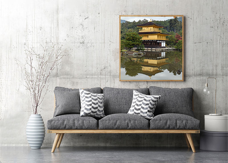
Special photos deserve to be printed on appropriate media and displayed in your home or office.
Article by Margaret Brown (see Margaret’s Photo Review pocket guides)
Excerpt from Photo Review Issue 102